Moving forward with my project:
Right now I am still trying to get a proper map set up in R. I pushed away from QGIS, which I’ve messed with a little this semester after installing it on my linux laptop. I don’t want to sound repetitive on this blog, and I have emphasized the fact that I think using R as much as possible is imperative for my own goals.
An article at R-Bloggers, shows that I’m not alone in my belief that R holds a an immidiate relevence: <http://www.r-bloggers.com/how-r-grows/> This article talks about how few packages (the programs that gives the R language its core functionality) were available before 2012. While the language itself has been around for quite a while, it has obviously found its audience only recently. The article also speaks about how much those using those packages owe to volunteers that host the packages a great deal of thanks.
That said, I’ve recently been having a lot of issues with my “mapmaking” in R. I’ve found a few options for a design of a London map to illustrate Pynchon’s Power-Series Distribution / The Slothrop Hardon Map. Below are a handful of my results. I’d post the code to go along with it, but it needs cleaning and proper citation of tutorials used, but I will post it before the semester’s end.

see http://cran.r-project.org/web/packages/maps/maps.pdf
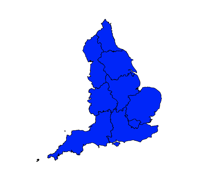
Map 1: This map is one easily pulled with the R “maps” package. I simply pull the specified “uk” vector from the supplied world map. But, believe me, this guy blown up is far from pretty, so I didn’t even bother.

see http://cran.r-project.org/web/packages/RgoogleMaps/RgoogleMaps.pdf
Map 2: The Google map. This one is not difficult to pull with the package “rgooglemaps”, but besides the fact that this map has far too much modern data, it is also another Google labelled map, and I want to stay away from that. However, I think further investigation is warranted. Another map that came up later was constructed at least in part thanks to Google Fusion Tables. The ability to zoom in on London was more of a success than I initially realized when compared with other attempts
Map 3: I was able to create this map thanks to a tutorial, however I wasn’t able to move beyond.

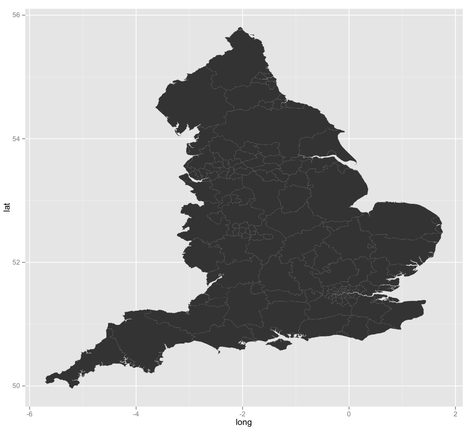
see http://spatial.ly/2010/09/maps-with-ggplot2/
Map 4: Obviously the most attractive of what I’ve been able to throw together, but I’ve had a rough time pulling this map away from the tutorial mediated data insertion. This map was built with a package that makes visualization in R far more attractive. Check out “ggplot2” if you are interested in knowing more.
see http://www.r-bloggers.com/mapping-primary-care-trust-pct-data-part-1/
Map 5: This map of the UK was also done in ggplot2, but the tutorial it was pulled from showed a bit more promise to my purposes… or at least I think it did?
So there you have it, I have some fun looking skeletal maps to start with, but the real difficulty comes in inserting my csv files with coordinates into R via ggplot2. I’m going to move onto trying to simply plot the lat/long of bombing points, and then hope that layering the information on top becomes easier. I’ve come close with some tutorials not discussed here… I think I’m a week away from seeing what I want to see.