
I’ve been enjoying my time in Lev Manovich’s Big Data class this semester, and I am currently working with R to create some visualizations of twitter trends with a package called twitteR specifically for my final project in Prof Manovich’s class.
This is a particularly difficult package to find good tutorials for. Why?
- Search engines, Google included, do not have a case-sensitive search option. Typing “R” and “Twitter” are not going to bring up any relevant information, (I found the most success typing “R language” and “twitteR package” – quotes included)
- Twitter’s original API allowed for manipulation of XML data which was heavily used in earlier twitteR experiments, most of which rise to the top of any search that is not time sensitive. I recommend searching “The past year” only.
- There is far more information available for just getting this package running than there are practical uses of the package
That said there have been two tutorials that have been especially helpful for me.
The first is just the general package description titled “Twitter client for R” by Jeff Gentry. This is essential for a general introduction to the package. It can be found here: <http://cran.r-project.org/web/packages/twitteR/vignettes/twitteR.pdf>
The second which I will be posting examples of my work with is called “Getting Started with Twitter Analysis in R” by AJ Hirst and can be found here: < http://blog.ouseful.info/2011/11/09/getting-started-with-twitter-analysis-in-r/>
For my final project in Prof Manovich’s class my current intention is to examine several aspects of the valuation of comic books from the sixties. I’ve built a dataset of the most popular 108 titles between 1960 and 1969. While some of these cultural artifacts are valued at thousands of dollars, others can be purchased for less than ten dollars. I’m curious as to where I can find some correlation between the value of these comics and trends in their popularity on the twitter network.
Because I’ve already alluded to my ineffable obsession with Scrooge McDuck on this blog, and this character seemed to rule the roost as far as nineteen-sixties comic book sales are concerned, I’m going to first run some analysis on the hashtag #Ducktales. (While Ducktales was not the title of any of the Scrooge McDuck comics, all the episodes of this program, including a motion picture, are based on the story lines found in the “Uncle Scrooge” comics)
The following .pngs illustrate the results I was able to construct thanks to the AJ Hirst tutorial cited earlier. I’ve included PDF versions of my charts as well so as to make the data more visible.
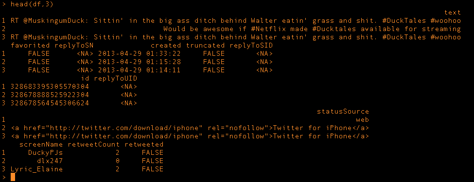
My terminal window showing a dataframe of the data I am visualizing
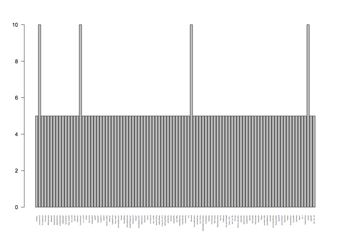
Visualization 1: Those who tweeted the #Ducktales hashtag the most from a collected random sample of #Ducktales tweets
PDF 1: ducky
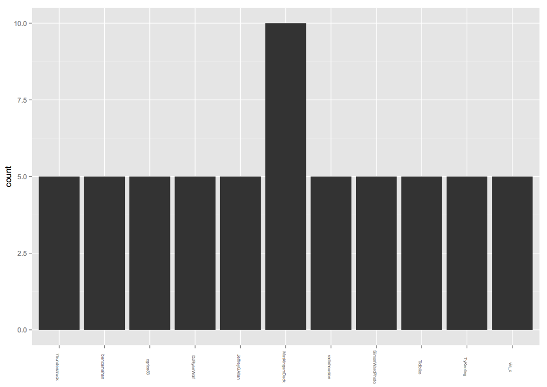
A more streamlined collection of data, still need to study code to see exactly what was pulled out of initial data.
PDF 2: ducky2